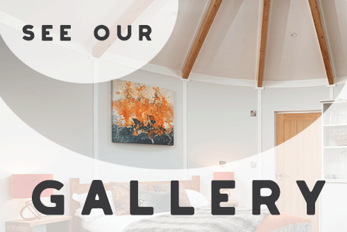
One definite perk of investing in a Rotunda Garden Room is that you have the opportunity to create your own unique space from the moment that you start engaging in conversation with us! The creative process behind each and every Rotunda is unique and this is one of the elements our clients most enjoy about the sales process. Not only do we sit down and plan each and every detail around you and your garden (position of the light switches and electrical sockets/window position/door opening/layout…etc!) but your paint finish is customised too! If you love a particular colour shade in your house, we’ll match it! If you have a painting which inspires you, we’ll pick a colour from it! A completely unique and creative customer journey which we doubt you’d find with any other garden room manufacturer. Interestingly, no two people are ever the same and as a direct consequence each Rotunda is completely unique! A couple of weeks ago we built & installed a Rotunda internally finished in a deep soulful red; this week we’re off to Hertfordshire with a blue Rotunda! (Interior, of course!) Other colours coming up on the Summer installations spectrum range from a dusky green to a bright daffodil yellow! What does the colour you choose say about you and the space you’re creating? It’s fascinating to think that the colour we surround ourselves in gives off a different vibrational frequency and affects our mood and activity within our garden building. Here are a few guidelines on colour and how it affects our psychology! (Information extracted from http://www.colour-affects.co.uk/psychological-properties-of-colours)
RED. Physical Positive: Physical courage, strength, warmth, energy, basic survival, ‘fight or flight’, stimulation, masculinity, excitement. Negative: Defiance, aggression, visual impact, strain. Being the longest wavelength, red is a powerful colour. Although not technically the most visible, it has the property of appearing to be nearer than it is and therefore it grabs our attention first. Hence its effectiveness in traffic lights the world over. Its effect is physical; it stimulates us and raises the pulse rate, giving the impression that time is passing faster than it is.
BLUE. Intellectual. Positive: Intelligence, communication, trust, efficiency, serenity, duty, logic, coolness, reflection, calm. Negative: Coldness, aloofness, lack of emotion, unfriendliness. Blue is the colour of the mind and is essentially soothing; it affects us mentally, rather than the physical reaction we have to red. Strong blues will stimulate clear thought and lighter, soft blues will calm the mind and aid concentration. Consequently it is serene and mentally calming. It is the colour of clear communication.
YELLOW. Emotional Positive: Optimism, confidence, self-esteem, emotional strength, friendliness, creativity. Negative: Irrationality, fear, emotional fragility, depression, anxiety. The yellow wavelength is relatively long and essentially stimulating. In this case the stimulus is emotional, therefore yellow is the strongest colour, psychologically. The right yellow will lift our spirits and our self-esteem; it is the colour of confidence and optimism.
GREEN. Balance Positive: Harmony, balance, refreshment, rest, restoration, reassurance, environmental awareness, equilibrium, peace. Negative: Boredom, stagnation, blandness, enervation. Green strikes the eye in such a way as to require no adjustment whatever and is, therefore, restful. Being in the centre of the spectrum, it is the colour of balance – a more important concept than many people realise. When the world about us contains plenty of green, this indicates the presence of water, and little danger of famine, so we are reassured by green, on a primitive level.
VIOLET. Spiritual Positive: Spiritual awareness, containment, vision, luxury, authenticity, truth, quality. Negative: Introversion, decadence, suppression, inferiority. The shortest wavelength is violet, often described as purple. It takes awareness to a higher level of thought, even into the realms of spiritual values. It is highly introvertive and encourages deep contemplation, or meditation.
ORANGE. Dynamic. Positive: Physical comfort, food, warmth, security, sensuality, passion, abundance, fun. Negative: Deprivation, frustration, frivolity, immaturity. Since it is a combination of red and yellow, orange is stimulating and reaction to it is a combination of the physical and the emotional. It focuses our minds on issues of physical comfort – food, warmth, shelter etc. – and sensuality. It is a ‘fun’ colour.
It’s a worth having a think about the type of experience you’re looking for when you’re looking through the colour chart and envisioning spending time in your Rotunda – i.e. green = relaxing garden room, blue = garden-office or studio, red = music room, violet = meditation/yoga room! Just another little thing to get excited about!
Copyright © Rotunda Eco Build Ltd.

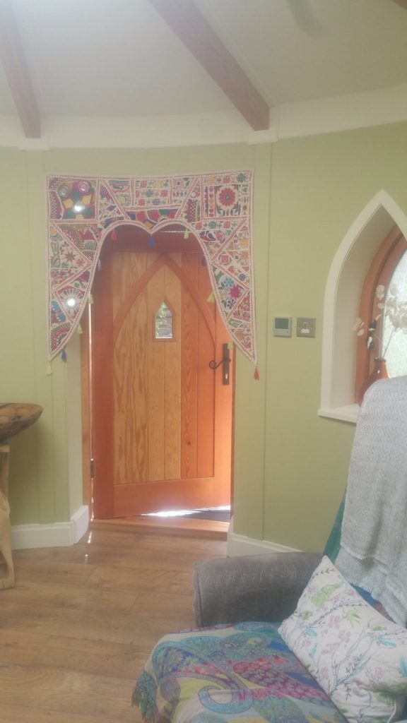 One definite perk of investing in a Rotunda Garden Room is that you have the opportunity to create your own unique space from the moment that you start engaging in conversation with us! The creative process behind each and every Rotunda is unique and this is one of the elements our clients most enjoy about the sales process. Not only do we sit down and plan each and every detail around you and your garden (position of the light switches and electrical sockets/window position/door opening/layout…etc!) but your paint finish is customised too! If you love a particular colour shade in your house, we’ll match it! If you have a painting which inspires you, we’ll pick a colour from it! A completely unique and creative customer journey which we doubt you’d find with any other garden room manufacturer. Interestingly, no two people are ever the same and as a direct consequence each Rotunda is completely unique! A couple of weeks ago we built & installed a Rotunda internally finished in a deep soulful red; this week we’re off to Hertfordshire with a blue Rotunda! (Interior, of course!) Other colours coming up on the Summer installations spectrum range from a dusky green to a bright daffodil yellow! What does the colour you choose say about you and the space you’re creating? It’s fascinating to think that the colour we surround ourselves in gives off a different vibrational frequency and affects our mood and activity within our garden building. Here are a few guidelines on colour and how it affects our psychology! (Information extracted from
  BLUE. Intellectual. Positive: Intelligence, communication, trust, efficiency, serenity, duty, logic, coolness, reflection, calm. Negative: Coldness, aloofness, lack of emotion, unfriendliness. Blue is the colour of the mind and is essentially soothing; it affects us mentally, rather than the physical reaction we have to red. Strong blues will stimulate clear thought and lighter, soft blues will calm the mind and aid concentration. Consequently it is serene and mentally calming. It is the colour of clear communication.